You can love or hate doing presentations, but you will definitely need to create them. In this article, we’ll teach you how to create the best PowerPoint presentations ever. We are going to talk about common mistakes of students in making presentations and the ways to avoid them. Also, we will provide you with tips on how to make a presentation that deserves only high grades.
Common Mistakes and How to Avoid Them
Mistake#1: Inappropriate Presentation Colors
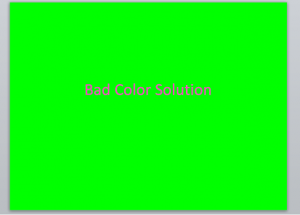
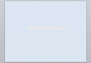
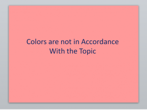
As you can see, the example with lurid colors is very unpleasant for human eyes. If you don’t want to blind your audience, don’t use such colors. And concerning faint colors: don’t use them either. You want anybody to be able to see the text on the screen.
How to Avoid?
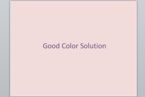
- Use neutral colors for the background that are friendly for human eyes, and dark colors for text. Or, use dark but not bright colors for the background and light colors for text.
Examples:
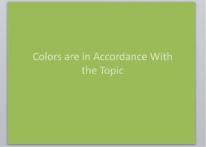
- Take into consideration the discipline and the topic. For example, if you make a presentation in botany you can use green colors. On the other hand, if you create a presentation in business you shouldn’t use fancy colors.
Examples:
Topic: Threat of Deforestation
Topic: New Technologies in 2016
Mistake#2: Straight Text
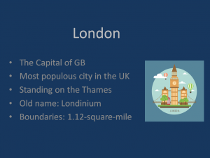
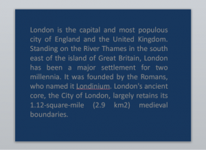 A lot of students think that the best PowerPoint presentations should contain all of the information on the topic. However, this is not true. Presentations are created with the purpose to assist you in conveying the topic to the audience. This means that you should not put straight text in
your presentation. Mostly, you should include tables, pictures, and bullet points. This example is difficult to perceive because you need to read the whole page to understand the gist. The example below demonstrates how you can organize the text so that it is easy to perceive.
How to Avoid?
- Include only key points. Your points should be short and clear.

- Add pictures that concern the topic.
- Each point should not be revealed in text.
- Organize the information in the form of lists, tables, and schemes.
Mistake #3: Wrong Usage of Pictures
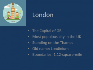
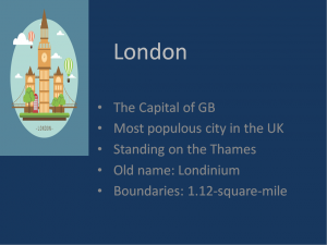
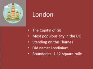
This mistake involves all the mistakes that concern usage of pictures. They are:
- Inappropriate size of pictures
- Colors are not suitable for presentation colors
- Wrong place for picture
Examples:
How to Avoid?
- If you need to stretch the picture, stretch it from the lower right angle. That way, you won’t spoil original proportions of the picture.
- When you make a presentation, use only high-quality pictures. Pictures with low quality look awful. They can only spoil the impressions from your presentation.
- Remember the law of copyright. Include pictures that do not infringe copyright. You can find such pictures on special websites such as Pixabay.com. Or, you can take a photo on your own.
- While choosing pictures, keep in mind the colors of your presentation. The colors of the picture should be in accordance with the colors of the presentation.
- Consider that the whole page of the presentation should look balanced. Put the picture in a way so that the whole page looks harmonious. The third picture in the previous paragraph is an example of an unbalanced slide.
Mistake#4: Bad Font Choice
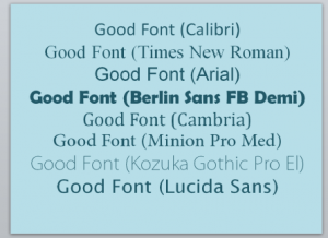
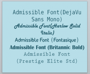
Many students choose the fanciest font with the aim to make their presentation look better. However, they often go a bridge too far. Because of this, a lot of presentations consist of information that is difficult to read and to understand. If you use a font that urges the audience to put a lot of effort to perceive the text, you can lose the audience’s attention quite quickly.
How to Avoid?
We have prepared for you lists with good, admissible, and ineligible fonts. When you choose a font make sure that it is easy to read.
- Calibri
- Times New Roman
- Arial
Berlin Sans FB Demi - Cambria
Minion Pro Med - Kozuka Gothic Pro El
- Lucida Sans
- DejaVu Sans Mono
- Harlow Solid Italic
- Fontasique
- Britannic Bold
- Prestige Elite Std
Ineligible Fonts
Mistake#5: Overloading Presentation With Animation
Some students overload their presentations with animation. As a result, the information is difficult to perceive. The audience can hardly understand and memorize the data which unexpectedly appears for three seconds and then suddenly disappears, or the words that are blinking all the time. Animation is essential for making the best PowerPoint presentations. It makes you presentation more dynamic. It can also simplify the process of presenting your project. However, you should be careful to use the appropriate type of animation in appropriate places.
How to Avoid?
The rule is simple: use animation when you find reason to do this. In other cases it’s useless. Here are reasons to use animation:
- If you need to show the information gradually.
- If you talk about some piece of information that has already appeared on the slide but you need to emphasize it again.
- If you need to make your presentation more dynamic.
Take into consideration:
- Some types of animation take a lot of time. Believe us, it’s awkward when you start talking about a subject that hasn’t yet appeared on the screen.
- Before you defend your presentation, you should probably rehearse your speech
 at home. Each slide takes you a specific period of time. However, you should take into account unexpected factors such as questions from the audience, technical glitches, or anything of this nature. Therefore, we recommend that you don’t use the option that implies an automatic start of the animation. You should use the option that allows you to control the
start of the animation on click.
Still Have Any Questions?
If you read our article but you still have some questions, such as “what are presentation ideas?” or “how to choose colors for presentations?” visit WritingCheap.com. It is a cheap custom writing service that can provide you with qualified assistance any time. Our writers will help you to find appropriate information and to choose the perfect words to express it. Also, our experts are capable of choosing the most harmonious pictures for your presentation. Service is available 24/7! Visit us now!
